
ClariMed RCM
A clear, confident website for a healthcare revenue cycle management company that helps medical and dental practices get paid faster.
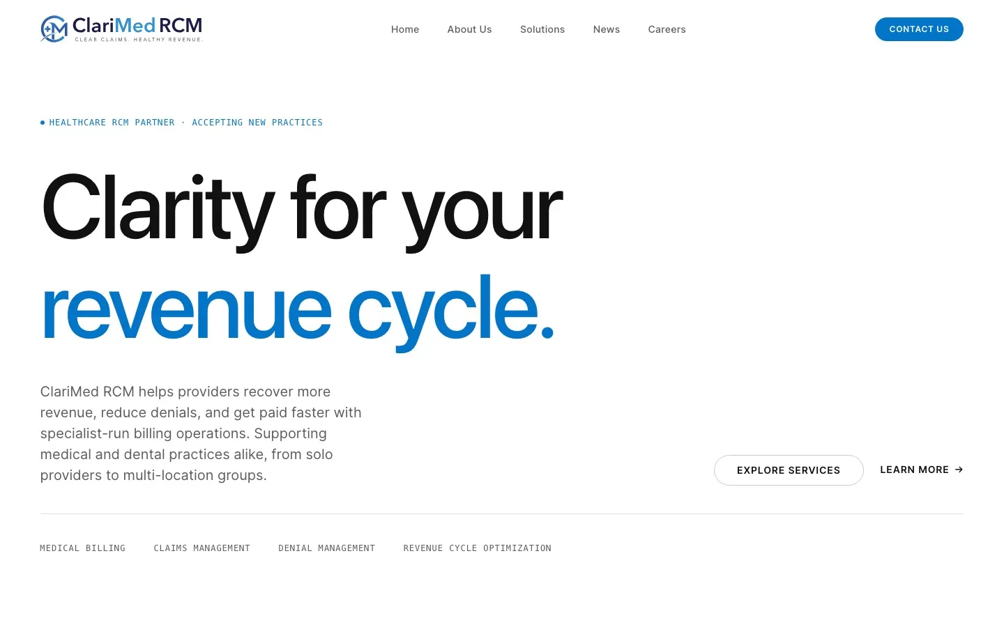
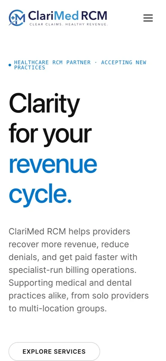
ClariMed RCM runs billing operations for medical and dental practices: medical billing, claims management, denial management and revenue cycle optimisation. The website had to make a complex, jargon-heavy service feel clear and trustworthy to practice owners.
The challenge
Revenue cycle management is full of jargon, and the buyers are busy clinicians and practice managers. The site needed to lead with outcomes, explain the service simply, and also attract billing specialists to join the team.
Designing for the people who use it
- 01Practice owners and managers, from solo providers to multi-location groups
- 02Healthcare organisations comparing billing partners
- 03Billing specialists looking for a new role
From first visit to the next step
- 1
See the promise
“Clarity for your revenue cycle” states the benefit in five words.
- 2
Check the results
A results section answers “will this pay off?” early.
- 3
Explore solutions
Medical billing, claims, denials and RCM optimisation.
- 4
Understand the process
“A process built for predictable revenue” shows how onboarding works.
- 5
Talk to the team
A blue Contact Us button sits in the header and closes the page.
Page structure
The homepage is planned as a sequence of sections, each answering the next question a visitor has. Below is that structure as a low-fidelity wireframe, with the site’s main navigation.
Colour, type and components
- Ink#111111
- Graphite#5D5D5D
- Silver#9E9E9E
- Mist#F5F5F5
- Clarity blue#0275C9
- 01A mostly monochrome layout with a single “clarity blue” mirrors the brand promise: less noise, clearer numbers.
- 02Large Space Grotesk headlines give a technical service a modern, confident voice.
- 03Monospaced labels list the services like an index, so scanning visitors find their need fast.
Designed for every screen
Development and launch
- 01Built with Next.js for speed and search visibility.
- 02A news section for ongoing content and search traffic.
- 03Dedicated privacy and information security policy pages, which matter to healthcare buyers.
- 04Careers section to support hiring.